Cambridge IELTS 18 Test 4 Writing Task 1: Metal Prices Graph
Cambridge IELTS 18 · Test 4 · Academic Writing Task 1Line graph
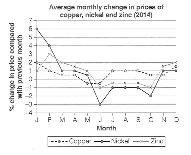
The line graph shows the average monthly percentage change in the prices of copper, nickel and zinc during 2014, with each figure measured against the price in the previous month. Values above zero mean the price rose that month and values below zero mean it fell.
The question
You should spend about 20 minutes on this task. The graph below shows the average monthly change in the prices of three metals during 2014. Summarise the information by selecting and reporting the main features, and make comparisons where relevant. Write at least 150 words.
Free and timed, with a live word count, just like the computer-delivered test. Then get an instant AI band score.
The exam simulator runs on a computer. Open this page on a laptop or desktop to practise.
Key features to report
- The graph shows percentage change compared with the previous month, not the price itself. A falling line that stays above zero, as in nickel from January to March, means the price was still rising but more slowly.
- All three metals rose in price at the start of the year, fell around the middle of the year and were rising again by the end: in June all three changes were negative, and in December all three were positive (copper about 1.5%, nickel 1% and zinc 2%).
- Nickel was the most volatile. It recorded the largest rise on the graph, 6% in January, and the largest fall, 3% in June; its price then fell every month until October (by 1% from July to September and 2% in October) before rising by 1% in November and December.
- Zinc followed a similar but milder pattern: its increase peaked at 3% in February, it fell by 1% in June, by about 0.5% a month from July to September and by 1% in October, then rose by about 1.5% in November and 2% in December.
- Copper was the most stable, with monthly changes between about -0.5% and 2%. Its price fell only in May and June (by about 0.5% each month) and rose steadily by 1% a month from July to September.
- From July to October copper was the only metal whose price was still rising.
Model overview
Overall, all three metals saw their prices rise at the beginning and end of 2014, with declines around the middle of the year. Nickel was by far the most volatile, recording both the largest monthly increase and the largest decrease, whereas copper fluctuated the least.
Paragraph plan
- 1
Introduction
Paraphrase the task in one sentence: the line graph shows how much the prices of copper, nickel and zinc changed on average each month in 2014, compared with the month before.
- 2
Overview
Without figures, state that all three prices rose at the start and end of the year and fell around mid-year, that nickel was the most volatile and that copper was the most stable.
- 3
Body paragraph 1: nickel and zinc
Describe nickel's 6% rise in January, slowing growth to 1% in March, the 3% fall in June, continued falls until October (2%) and 1% rises in November and December. Then compare zinc: a peak of 3% in February, a 1% fall in June, small falls until October and a 2% rise in December.
- 4
Body paragraph 2: copper
Explain that copper changed least, staying between about -0.5% and 2%, that its price fell only in May and June, rose by 1% a month from July to September while the other two metals were falling, and ended the year with a rise of about 1.5%.
Useful comparisons
- Group nickel and zinc together because both rose strongly early in the year and fell from June to October, then contrast them with copper.
- Divide the year into three phases: rising prices from January to April, falls around June and in the following months, and renewed rises in November and December.
- Compare the extremes: nickel's 6% rise in January and 3% fall in June show a range of 9 percentage points, compared with only about 2.5 points for copper.
- Highlight June as the month when all three metals fell in price at the same time.
- Point out that from July to October copper prices kept rising by up to 1% a month while nickel and zinc prices fell.
- Note that a line moving downwards above zero means slower growth, not a fall in price, for example nickel from January to March.
Band 8+ model answer
208 words · An original model answer written for ieltswrites, not an official answer. It stays in English, as in the exam.
The line graph shows the average percentage change in the prices of copper, nickel and zinc each month in 2014, compared with the previous month.
Overall, all three metals saw their prices rise at the beginning and end of the year, with declines around the middle of the year. Nickel was by far the most volatile, recording both the largest monthly increase and the largest decrease, whereas copper fluctuated the least.
Nickel began the year with a 6% rise in January, but its growth slowed sharply to just 1% by March. In June, its price dropped by 3%, and it continued to fall every month until October, when it declined by 2%, before returning to growth of 1% in November and December. Zinc followed a similar but milder pattern: its increase peaked at 3% in February, turned into a 1% fall in June and remained slightly negative until October, before the metal ended the year with a 2% rise.
By contrast, copper was far more stable, with monthly changes of between roughly -0.5% and 2%. Its price fell only in May and June, and from July to September, when the other two metals were losing value, it rose by 1% each month. In December, it gained about 1.5%.
Why this answer scores highly
- Task Achievement
- The answer correctly interprets the data as monthly percentage changes rather than prices, gives a clear overview of the shared pattern and of nickel's volatility, and selects the most significant figures accurately.
- Coherence and Cohesion
- Nickel and zinc are compared in one paragraph because they followed a similar path, and copper is contrasted in the next, with linking devices such as by contrast, then and meanwhile guiding the reader.
- Lexical Resource
- Precise language for change, such as growth slowed, turned negative, declined, recovered and volatile, shows the writer understands the difference between slower growth and an actual fall in price.
- Grammatical Range and Accuracy
- The answer uses complex sentences with relative and participle clauses, comparative and superlative forms, and accurate past tenses throughout.
Useful vocabulary
- month-on-month change
- the difference between one month and the month before
- percentage change
- how much something rises or falls, expressed as a percentage
- volatile
- changing often and by large amounts
- fluctuate
- rise and fall irregularly
- slow down
- continue rising but at a lower rate
- turn negative
- change from an increase to a decrease
- decline
- a fall in price
- recover
- return to rising after a period of falling
- modest rise
- a fairly small increase
- sharp drop
- a sudden large fall
- remain in positive territory
- stay above zero, meaning the price kept rising
- percentage points
- the arithmetic difference between two percentages
- a broadly similar pattern
- a trend that is mostly the same as another one
Common mistakes
- Treating the figures as prices, for example saying nickel cost 6% or that its price fell from January to March, when the price was still rising, only more slowly.
- Confusing a fall in the line with a fall in price; the price only fell when the value was below zero.
- Describing all twelve months for each metal in turn, which produces a long list with no comparisons.
- Missing the key contrast that copper was still rising from July to October while nickel and zinc were falling.
- Leaving out an overview or not identifying nickel as the most volatile metal.
- Misreading values, for example giving zinc's February peak as 4% or nickel's June figure as -2%.
Frequently asked questions
- Which Cambridge book is this question from?
- This line graph about the average monthly change in the prices of copper, nickel and zinc in 2014 is Writing Task 1 of Test 4 in Cambridge IELTS 18 Academic, published in 2023.
- Does a falling line mean the price went down?
- Not always. The graph shows the percentage change from the previous month, so the price only fell when the line was below zero. A line that falls but stays above zero means the price was still rising, just more slowly.
- Do I need to describe every month?
- No. Focus on the key points: the large early rises for nickel and zinc, the June falls, nickel's extremes, copper's stability and the rises in December.
- How many words should I write for this Task 1?
- Write at least 150 words; around 170-200 words is enough to give an overview and compare the three metals in 20 minutes.
Free and timed, with a live word count, just like the computer-delivered test. Then get an instant AI band score.
The exam simulator runs on a computer. Open this page on a laptop or desktop to practise.