Cambridge IELTS 14 Test 2 Writing Task 1: Export Earnings
Cambridge IELTS 14 · Test 2 · Academic Writing Task 1Mixed charts
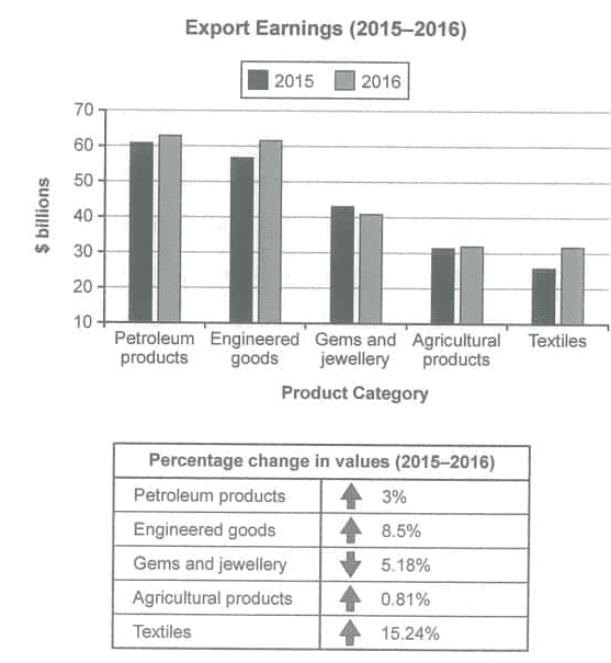
The bar chart shows the value of one country's exports in five product categories in 2015 and 2016, measured in billions of US dollars. The table gives the percentage change in the value of each category between 2015 and 2016.
The question
You should spend about 20 minutes on this task. The chart below shows the value of one country’s exports in various categories during 2015 and 2016. The table shows the percentage change in each category of exports in 2016 compared with 2015. Summarise the information by selecting and reporting the main features and make comparisons where relevant. Write at least 150 words.
Free and timed, with a live word count, just like the computer-delivered test. Then get an instant AI band score.
The exam simulator runs on a computer. Open this page on a laptop or desktop to practise.
Key features to report
- Petroleum products were the most valuable export in both years, rising from just over $60 billion to about $63 billion, an increase of 3%.
- Engineered goods were the second largest category and grew by 8.5%, from about $57 billion to just over $61 billion, almost catching up with petroleum products.
- Gems and jewellery was the only category to fall, by 5.18%, from roughly $43 billion to just over $40 billion.
- Agricultural products barely changed, staying at about $31 billion with growth of only 0.81%.
- Textiles showed the biggest percentage rise, 15.24%, climbing from about $25 billion, the lowest figure on the chart, to just over $30 billion, roughly level with agricultural products.
- The two visuals should be integrated: use the bar chart for approximate dollar values and the table for the exact percentage changes.
Model overview
Overall, petroleum products and engineered goods generated the highest export earnings in both years, and the value of every category except gems and jewellery increased. Textiles recorded by far the fastest growth, while agricultural products remained almost unchanged.
Paragraph plan
- 1
Introduction
Paraphrase both visuals in one or two sentences: the bar chart compares the value of a country's exports in five categories in 2015 and 2016 in billions of dollars, and the table shows the percentage change in each category.
- 2
Overview
Give the main points without figures: petroleum products and engineered goods were the top two earners, all categories grew except gems and jewellery, and textiles grew fastest.
- 3
Body paragraph 1: the two largest categories
Describe petroleum products (just over $60 billion to about $63 billion, up 3%) and engineered goods (about $57 billion to just over $61 billion, up 8.5%), noting that the gap between them narrowed.
- 4
Body paragraph 2: the three smaller categories
Contrast gems and jewellery, the only category to fall (5.18%, from about $43 billion to just over $40 billion), with agricultural products, almost unchanged at about $31 billion (0.81%), and textiles, which rose by 15.24% from about $25 billion to just over $30 billion.
Useful comparisons
- Group the two leading categories, petroleum products and engineered goods, which both earned around $60 billion.
- Contrast the only decline (gems and jewellery) with the four categories that grew.
- Compare the size of growth: textiles rose by 15.24%, almost twice the rate of engineered goods (8.5%) and about five times the rate of petroleum products (3%).
- Note the near stability of agricultural products, whose 0.81% rise is too small to see on the bar chart.
- Highlight changes in rank or gaps: engineered goods narrowed the gap with petroleum products, and textiles drew roughly level with agricultural products.
- Combine the visuals in each sentence, giving an approximate dollar value from the chart and the exact percentage from the table.
Band 8+ model answer
191 words · An original model answer written for ieltswrites, not an official answer. It stays in English, as in the exam.
The bar chart compares the value of one country's exports in five product categories in 2015 and 2016, measured in billions of dollars, while the table gives the percentage change in each category over the same period.
Overall, petroleum products and engineered goods were the most lucrative exports in both years, and earnings rose in every category except gems and jewellery. Textiles recorded by far the fastest growth.
Petroleum products generated the most revenue, rising slightly from just over $60 billion in 2015 to about $63 billion in 2016, an increase of 3%. Engineered goods grew more strongly, by 8.5%, from roughly $57 billion to just over $61 billion, almost closing the gap with petroleum.
Gems and jewellery was the only category to decline, with earnings falling by 5.18% from around $43 billion to just over $40 billion. Agricultural products remained virtually unchanged at about $31 billion, edging up by a mere 0.81%. Textiles, by contrast, rose by 15.24%, almost twice the rate of engineered goods. Having been the smallest category in 2015, at about $25 billion, textiles earned just over $30 billion in 2016, drawing roughly level with agricultural products.
Why this answer scores highly
- Task Achievement
- The answer gives a clear overview of the leading categories, the single decline and the fastest growth, and supports each point with approximate values from the chart combined with exact percentages from the table.
- Coherence and Cohesion
- The body is organised by grouping the two large categories and then the three smaller ones, and linkers such as by contrast, meanwhile and as a result connect the two visuals naturally.
- Lexical Resource
- Precise phrases such as the most lucrative, a marginal rise, virtually unchanged and narrowing the gap avoid repetition and describe the size of change accurately.
- Grammatical Range and Accuracy
- Past tenses are used correctly for 2015 and 2016, and the answer includes relative clauses, participle phrases and comparatives such as almost twice the rate of, all with accurate punctuation.
Useful vocabulary
- export earnings
- the money a country receives from selling goods abroad
- product category
- a group of similar goods, such as textiles or engineered goods
- engineered goods
- manufactured products such as machinery, vehicles and equipment
- generate revenue
- produce income
- the most lucrative
- the one that earns the most money
- a marginal increase
- a very small rise
- virtually unchanged
- almost exactly the same as before
- the only category to decline
- the single group whose value went down
- the fastest growth
- the largest percentage rise
- narrow the gap
- reduce the difference between two figures
- draw level with
- reach the same value as another category
- year on year
- compared with the previous year
- in billions of dollars
- the unit used on the bar chart
- respectively
- in the same order as the items just mentioned
Common mistakes
- Describing only the bar chart or only the table instead of linking the dollar values with the percentage changes.
- Confusing percentage change with dollar value, for example saying textiles earned the most because they had the largest percentage increase.
- Writing that the country exported more products, when the chart shows the value of exports, not the quantity.
- Forgetting that gems and jewellery fell while every other category rose, which is a key feature.
- Reading values inaccurately from the y-axis, which starts at 10 rather than 0, so the bars exaggerate the differences between categories.
- Listing the five categories one after another with no overview or comparisons.
Frequently asked questions
- Which Cambridge book is this question from?
- This bar chart and table about a country's export earnings in 2015 and 2016 are Writing Task 1 of Test 2 in Cambridge IELTS 14 Academic, published in 2019.
- Should I describe the bar chart and the table separately?
- It is better to combine them. For each category, give an approximate dollar value from the chart and the exact percentage change from the table in the same sentence.
- What category is this Task 1 question?
- It is a mixed question because it combines two different visuals, a bar chart and a table, which must both be summarised and compared.
- How many words should I write for this Task 1?
- Write at least 150 words; around 170-200 words is enough to cover all five categories briefly with a clear overview.
Free and timed, with a live word count, just like the computer-delivered test. Then get an instant AI band score.
The exam simulator runs on a computer. Open this page on a laptop or desktop to practise.