Cambridge IELTS 16 Test 1 Writing Task 1: Household Appliances
Cambridge IELTS 16 · Test 1 · Academic Writing Task 1Mixed charts
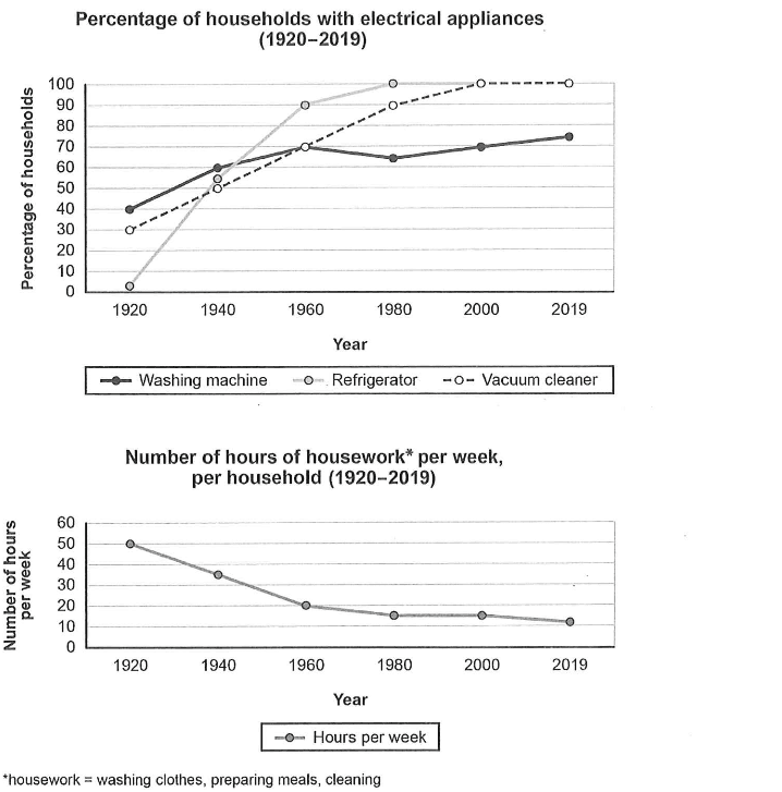
Two line graphs cover one country from 1920 to 2019. The first shows the percentage of households owning a washing machine, a refrigerator and a vacuum cleaner; the second shows the number of hours of housework (washing clothes, preparing meals and cleaning) done per household each week, at roughly twenty-year intervals.
The question
You should spend about 20 minutes on this task. The charts below show the changes in ownership of electrical appliances and amount of time spent doing housework and households in one country between 1920 and 2019. Summarize the information by selecting and reporting the main features, and make comparisons where relevant. Write at least 150 words.
Free and timed, with a live word count, just like the computer-delivered test. Then get an instant AI band score.
The exam simulator runs on a computer. Open this page on a laptop or desktop to practise.
Key features to report
- Ownership of all three appliances is higher in 2019 than in 1920, while weekly housework falls throughout, so the two graphs show opposite trends that should be linked.
- Refrigerators show the most dramatic change: from almost no households (about 2-3%) in 1920 to about 55% in 1940, 90% in 1960 and 100% from 1980 onwards.
- Vacuum cleaners rise steadily from 30% in 1920 to 50% in 1940, 70% in 1960 and 90% in 1980, reaching 100% in 2000 and staying there in 2019.
- Washing machines start as the most common appliance at 40% in 1920 and reach 60% in 1940 and 70% in 1960, but then dip to about 65% in 1980 before rising only to 70% in 2000 and 75% in 2019, so from 1980 they are the least widespread.
- Housework falls sharply from 50 hours a week in 1920 to 35 hours in 1940 and 20 hours in 1960, then levels off at about 15 hours in 1980 and 2000 and edges down to just over 10 hours in 2019.
- The biggest changes in both graphs happen between 1920 and 1960; after 1960 the lines become much flatter.
Model overview
Overall, the proportion of households owning each appliance increased over the century, with refrigerators and vacuum cleaners eventually found in every home, whereas washing machines grew more slowly and became the least common from 1980. Meanwhile, the time spent on housework fell considerably, with most of the decline occurring before 1960.
Paragraph plan
- 1
Introduction
Paraphrase the task in one sentence: the graphs show what percentage of households in one country owned a washing machine, a refrigerator and a vacuum cleaner, and how many hours of housework each household did per week, between 1920 and 2019.
- 2
Overview
State the two big pictures without figures: appliance ownership rose, with fridges and vacuum cleaners reaching every household and washing machines lagging behind, while housework time fell, mostly in the first forty years.
- 3
Body paragraph 1: appliance ownership
Describe the refrigerator's surge from almost zero in 1920 to 90% in 1960 and 100% in 1980, the steady rise of vacuum cleaners from 30% to 100% by 2000, and the washing machine's rise from 40% to 70% in 1960, slight dip to about 65% in 1980 and modest recovery to 75% in 2019.
- 4
Body paragraph 2: hours of housework
Report the fall from 50 hours a week in 1920 to 20 hours in 1960, the plateau at about 15 hours in 1980 and 2000, and the final figure of just over 10 hours in 2019. You may note that the steepest fall coincides with the fastest spread of appliances, but do not claim one caused the other.
Useful comparisons
- Contrast the rising lines in the first graph with the falling line in the second graph.
- Group refrigerators and vacuum cleaners together as the two appliances that reach 100% ownership, then treat washing machines separately.
- Highlight the reversal in rankings: washing machines are the most common appliance in 1920 and 1940 but the least common from 1980 onwards.
- Note the convergence point in 1960, when washing machines and vacuum cleaners both stand at 70%.
- Divide the housework data into two periods: a rapid fall from 1920 to 1960 and a much slower decline afterwards.
- Compare the size of change: refrigerator ownership rises by almost 100 percentage points, while washing machine ownership rises by only 35.
Band 8+ model answer
202 words · An original model answer written for ieltswrites, not an official answer. It stays in English, as in the exam.
The line graphs illustrate the proportion of households in one country that owned three electrical appliances between 1920 and 2019, together with the number of hours each household spent on housework per week over the same period.
Overall, ownership of all three appliances increased, with refrigerators and vacuum cleaners eventually becoming universal, whereas washing machines were the least common from 1980 onwards. At the same time, the weekly time devoted to housework fell sharply, particularly during the first four decades.
In 1920, refrigerators were almost unheard of, but their ownership soared to 90% by 1960 and reached 100% in 1980. Vacuum cleaners spread more steadily, rising from 30% of homes to 90% in 1980 and to every household by 2000. Washing machines, by contrast, were the most widespread appliance in 1920, at 40%, and climbed to 70% in 1960, but after a slight dip to about 65% in 1980 they rose only modestly, to 75% in 2019.
Meanwhile, the amount of housework dropped from 50 hours a week in 1920 to 20 hours in 1960. The decline then slowed considerably, with the figure levelling off at around 15 hours between 1980 and 2000 before easing to just over 10 hours in 2019.
Why this answer scores highly
- Task Achievement
- The answer covers both graphs, gives a clear overview of rising ownership and falling housework time, and supports the key features with accurate figures, including the washing machine dip and the housework plateau.
- Coherence and Cohesion
- One body paragraph is devoted to each graph, appliances are grouped by their pattern of change, and linking words such as meanwhile, by contrast and then move the reader smoothly through the data.
- Lexical Resource
- Precise trend vocabulary such as soared, levelling off, slight dip and almost unheard of is used naturally, and the topic is paraphrased with homes, domestic chores and the time devoted to housework.
- Grammatical Range and Accuracy
- The answer uses past tenses accurately, combines clauses with participle phrases and relative structures, and handles comparisons such as the least common and much more slowly without errors.
Useful vocabulary
- household appliances
- electrical machines used in the home, such as fridges and washing machines
- ownership
- the fact of having something; used here for the share of homes that have each appliance
- the proportion of households
- the share of all homes, a paraphrase of percentage of households
- domestic chores
- routine housework such as cleaning, cooking and washing clothes
- soar
- rise very quickly to a high level
- universal
- found in every household, i.e. at 100%
- level off
- stop rising or falling and stay about the same
- plateau
- a period when a figure stays stable after changing
- dip slightly
- fall a little for a short time
- modest recovery
- a small rise after a fall
- percentage points
- the difference between two percentages, e.g. from 40% to 75% is 35 points
- the time devoted to
- the time spent on a particular activity
- lag behind
- develop more slowly than others
Common mistakes
- Describing only one of the two graphs, or writing about them in separate halves with no overview that connects rising ownership and falling housework time.
- Claiming that the appliances caused the fall in housework as a fact; Task 1 asks you to report data, not to explain causes.
- Misreading the washing machine line, for example saying it rose continuously, when it actually dips to about 65% in 1980.
- Saying refrigerators started at 0% or at 10%; the 1920 value is just above zero.
- Writing the housework graph in percentages instead of hours per week.
- Listing every value year by year instead of selecting the main trends and comparisons.
Frequently asked questions
- Which Cambridge book is this question from?
- This question about household appliances and hours of housework is Writing Task 1 of Test 1 in Cambridge IELTS 16 Academic, published in 2021.
- Should I describe both graphs in the same paragraph?
- It is usually clearer to give each graph its own body paragraph and to link them in the overview, where you can point out that ownership rose while housework time fell.
- Can I say that appliances reduced the time spent on housework?
- You can note that the two trends happened at the same time, but avoid stating a cause as fact, because Task 1 only asks you to report what the graphs show.
- How many words should I write?
- Write at least 150 words; about 170-200 words is enough to cover both graphs, an overview and the key figures in 20 minutes.
Free and timed, with a live word count, just like the computer-delivered test. Then get an instant AI band score.
The exam simulator runs on a computer. Open this page on a laptop or desktop to practise.